Role Project Manager and Designer. Duration Sept 2022 -- Jun 2023
Team HCDE Design Team Tools Microsoft Whiteboard, Figma, Google Suite
Microsoft Whiteboard Overview
Microsoft Whiteboard delves specifically into the brainstorming and ideation space that heavily benefits from organic conversation and the natural flow of ideas which largely comes from human connection that was promoted by in-person interaction. We are reflecting on the framework of Microsoft Whiteboard and discovering new opportunities that an improved ideation platform could bring to strengthen human connection and the flow of ideas in a digital space.
How might we build trust and human connection in a brainstorming session done using a Whiteboard in Teams so it will be as generative, inclusive, and collaborative?
User Research
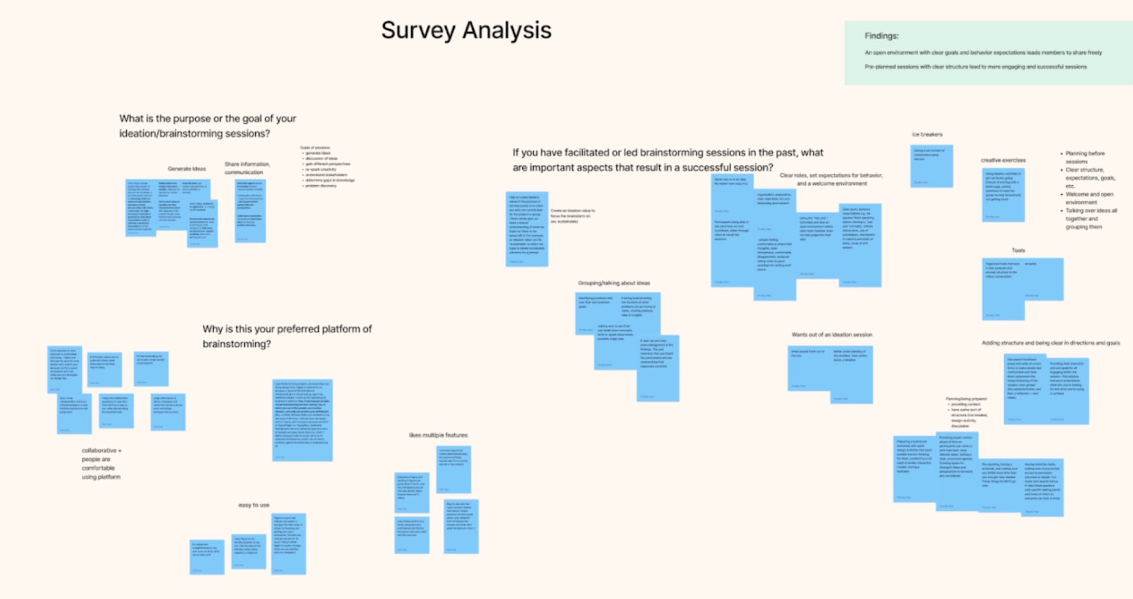
Our research consisted of a survey, interviews, and observation sessions.
Participants
For our surveys, interviews, and observation session, our participants were people in our group’s network as well as others that were reached via social media platforms such as LinkedIn and Slack communities. The criteria for our research participants were anyone who has had experience with brainstorming platforms in the past 6 months. With our surveys we were able to garner 29 participant responses, 8 interviews with ideation facilitators and/or participants, and 6 users for our observation session.
Specifically in our survey, we reached out to both students and working professionals and we saw a split of 16 working professionals in comparison to 13 UW students. With our interviews, we had 4 interviews with working professionals and 4 with students. Lastly, for our observation session all participants were students.
Research Questions
Background Use of Online Brainstorming Tools
- What do users like/dislike about their current brainstorming tool?
- What features lead to positive experiences?
- What are features that could be changed or added in to improve their experience?
Brainstorming Sessions
- What is the goal of the brainstorming/ideation session?
- What are the main differences between in-person and online ideation sessions?
Understanding How Users Communicate
- What methods are used to try and cultivate human connection in online sessions?
- Do participants have side conversations in ideation sessions? If so, how might it differ online versus in-person?
Test Session and Environments
In our interviews and observation sessions, they were all conducted over Zoom since it allowed for people from various locations to all meet up. With our interviews there were two people from our group, one person to lead the interview and another to take notes. In our observation session, we had one person facilitating the session while two other members took notes. Throughout all of these sessions we tried to ensure a comfortable environment to make sure that the participants felt safe. We did this through letting the participants know they could leave at any time if they felt uncomfortable as well as reiterating that they could ask questions at any time. We also prefaced in these sessions that we weren’t judging them in any way and that their identities would be anonymous.
Methods
Survey
To begin our surveys, we first tried to understand what the purpose of our survey was going to be. We knew that we wanted to conduct interviews later on so the goal of our survey was to get basic insights to ideation sessions such as what tools people use and why but also to see who would be interested in follow-up interviews.
As mentioned above, we were able to get 29 participants for our survey with 16 of them being working professionals and 13 being students. We got these participants through posting on various social platforms such as Reddit, Slack, and LinkedIn, as well as word of mouth. This was a good split between participants. We found that the findings weren’t too different from another in terms of the purpose of the ideation session as well as common themes surrounding why they wanted to use a particular ideation tool.
With the insights regarding the goal of the session and the reason for using a tool, we began jotting them down in stickies in Figjam. Once they were all written down we did affinity diagramming by grouping the findings to see if there was additional information we wanted to pursue in interviews.
Interviews
Our interviews they were all conducted over zoom due to differing locations between us and our participants. In each session we had one person conducting the interview while another group member was taking notes on what the participant had to say. The purpose of our interviews was to dig into specific insights regarding how ideation sessions are conducted online versus in-person, and how we can create a human connection in an online space. We decided to do semi-structured interviews so that we could dive deeper into certain areas or points that our participants made, and see if we could find any key insights in that regard.
We first conducted 4 interviews with working professionals that all had experience facilitating ideation sessions as well as being participants in them. In these sessions, we referenced our interview kit in which we aimed to get information regarding what the goals facilitators specifically aim for, differences between in-person and online ideation sessions, and how they foster connection in an online space. Once we finished our 4 interviews, we analyzed them in FigJam by grouping similar sticky notes with quotes and findings from the interviews and then coming up with themes for each grouping.

After these initial 4 interviews with working professionals, we also wanted to hear from students who had experience in observation sessions as well. We then reached out to students and had 4 student interviews as well focusing on the same key areas of the goals of a session from a participant perspective, the differences with in-person and online sessions, and how comfortable they feel in online sessions. Similarly to the first 4 interviews, we then wrote stickies in FigJam with information from the interviews and affinity diagrammed them.

Once our working professional and student interview information was all grouped we then looked to combine the information together and see what common themes were found amongst both kinds of interviews. From this point, we saw what the common themes were and these became our findings that we decided to focus on.
Observation Sessions
For our observation session, we wanted to conduct a full ideation session where we could observe the flow of interactions and conversation between the participants. In order to do so, we followed a general outline of an ideation session:
- Welcome and intros/bonding (5 minutes)
- Ice breaker (5 minutes)
- Introduce the prompt (5 minutes)
- Brainstorm session (30 minutes)
- Crazy 8s (8 minutes)
- Mind Mapping (10 minutes)
- Group brainstorming (6 minutes)
- Narrow down (15 minutes)
- Present ideas (5 minutes)
- Questions and wrap (5 minutes)
The ideation session was centered around the question “How can Dubs (UW’s canine mascot) say hi to every student before they graduate?”. We decided on this topic to make the ideation session fun for our participants and for them to be able to think outside of the box. We had only three design requirements: for participants to show their thought process, the “hi” from Dubs had to be a physical interaction (a lick, shake, or petting Dubs), and they had to think outside of the box. We paid particular attention to the meat of the ideation session, which was the brainstorming section. Lily, the facilitator of the session, guided the participants through three activities to ideate a solution for Dubs to greet every student before they graduate.

From our observation session, we put together notes about what we saw. After compiling our notes, we conducted another round of affinity diagramming to analyze our findings.
We took away three main findings from our observation session:
- Participants are hesitant to be the first to break the silence in an online observation session.
- Conversation dominators crop up during group discussion.
- Participants do try to have side conversations to foster connection with one another but side conversations were largely limited and sparse throughout the session.
Key Findings
Finding 1: Online brainstorming features such as screen sharing, spotlight/following others, and managing/organizing information can also provide a level playing field for all participants, leading to a more inclusive and efficient brainstorming process.
Our first finding relates to advantages of using an online tool for ideation platforms such as Miro and Figjam. When we dug into what participants enjoy about ideating online the general feeling was that the features offered made it accessible and effective. To expand on this, one participant said, “It’s more effective brainstorming as I can use slack huddles (audio), share screen, chat in slack, work at the same time on Figma, send images for inspiration, and free form brainstorming.” This participant noted that in an online setting there are an abundant amount of resources available to use in the ideation sessions which help not only create more opportunities for communication but also more effective work times.
Another participant expanded on the effectiveness of online sessions being how information is relayed faster. They said, “Online brainstorm sessions feel more fast. Fast in terms of delivery of information. Online seems more efficient.” The point brought up from this is that in an online setting information is transferred more quickly from one participant to another. This can be due to the tools itself as well as everyone having access to the same screens, shared documents, and other brainstorming features. Compared to an in-person session people may be working in different areas in a room and having to convey a finding may take longer with people walking over and trying to analyze the information that they have not seen before.
Another comment in regards to the advantages of an online brainstorming session is the level playing field for all participants. A participant mentioned, “There is value in that everyone is able to view the same thing and be on the same page and participate equally.” Through an online platform, all participants in an ideation session will be able to see the same things and you can share ideas to a board where people might feel more comfortable than seeing your idea being written by someone else and posted on a board in person.
Overall, we noted down that there were a lot of advantages to an online brainstorming session. However, the key insight we narrowed down to was that the features and ability to manage and organize information created a level playing field for everyone in the session and offered a more efficient and inclusive session.
Finding 2: Online sessions lose the spontaneous and natural avenues of communication that build trust and spark creativity in participants.
This finding relates to our interview questions regarding what the differences between in-person and online sessions were and particularly what online sessions fail to offer compared to in-person ones.
In regards to engagement online versus in-person, a participant mentioned “Online, I can’t engage in the same way, can’t do multiple side conversations at the same time, bounce ideas off each other, there is a lack of a chaotic atmosphere where more raw ideas are able to form.” Through an online platform, the feeling of a natural conversation whether in a group or a side conversation becomes lost. In the process of these spontaneous interactions, there are ideas that flow from one to another and this results at times in effective ideation sessions. Similarly when asked about the benefits of in-person sessions, another participant said, “More opportunities to engage with people and bond.” The participant expanded by mentioning in-person there seems to be more natural conversations occurring and opportunities to talk with other people in the room which creates connections with others.
Another comment on this area was “I prefer in person brainstorming because it makes it easier to get to know everyone more naturally in a more engaged manner.” Many participants brought up this word “natural” when speaking to in-person sessions. The feeling of not having to work for a conversation as they might have to over an online platform allows for more attention to talking about ideas and getting feedback.
From the participants, we noted that the main struggles with online sessions happen with an inability to have natural avenues of communication. This lack limits the sense of familiarity with one another which can limit creativity and trust with one another.
Finding 3: Goofy and silly features such as avatars, stickers, and reactions help address the lack of spontaneity and bring back the fun and creativity that promotes generating ideas.
Although online sessions and platforms lack the physical interactions people might make in real life, such as high fives and body language that convey emotions, there were still efforts and avenues made online to mimic that aspect of in-person interactions. One example is when an interview participant talked about how “Emotes can make a fun collaborative environment such as high five on FigJam”. The participant is referring to a ‘hidden’ feature on the platform where if two people hold the spacebar and wave their cursor against each other, it creates a high five motion that mimics the fun, collaborative atmosphere of an in-person session.
Another similar aspect that exists in the online world is in regards to stickers and reactions that attempt to create a less serious atmosphere and bring back the fun and creativity into the session. One participant notes that “using stickers such as animated stickers even though they are more complicated they could be helpful for communicating ideas non verbally”. Not only did using stickers help with the communication ideas, but another participant noted that they prefer a certain platform over another (Figma) because it has stickers and stamps.
Recommendations
Recommendation 1: Based on the finding that being able to follow others and see their progress leads to a more inclusive and efficient brainstorming process, our recommendation is to strengthen participant visibility by including more cues showing their actions.
An example of this would be to add name tags to cursors to signify the presence of another participant to give the impression of togetherness and collaboration in an online space. Another example would be to allow typing to appear on sticky notes. Currently, words on a sticky note appear all at once instead of the natural flow of typing appearing. Adding this signifier would likely improve the efficiency of collaboration as participants are able to see changes in real time and not in a choppy sort of flow. Lastly, allowing participants to have some sort of organizational information such as adding pages or layers to a brainstorming phase may help with managing ideas.
Recommendation 2: Drawing from our second finding, we recommend that Microsoft Whiteboard promotes features that encourage group and pair conversation and collaboration.
Our second finding focuses on how there is a lack of spontaneous and natural avenues of communication in the platform. We suggest that there should be more features that help facilitate more opportunity to convey emotion. Another recommendation is to have features that encourage group and side conversations, where two people who are having a side conversation will automatically have focus on each other’s audio and/or video.
Recommendation 3: To promote fun and creativity in online brainstorming sessions, we recommend incorporating goofy and silly features into the online brainstorming space.
A common theme that has been constant throughout our survey, interviews, and observation session is that anything lighthearted and silly can brighten and close the distance that comes with the online brainstorming experience. By incorporating goofy and silly features such as avatars, stickers, reactions, and features that enable participants to convey emotion can help to humanize the online experience. An example of this is to add built-in ice breaker features to boost participant familiarity and encourage the participants’ comfortability to share ideas.
Conclusion
Overall, our research methods of survey, interviews, and observation sessions allowed us to generate findings in relation to in-person versus online ideation sessions. The findings we were able to generate from these methods were:
- Online brainstorming features such as screen sharing, spotlight/following others, and managing/organizing information can also provide a level playing field for all participants, leading to a more inclusive and efficient brainstorming process.
- Online sessions lose the spontaneous and natural avenues of communication that build trust and spark creativity in participants.
- Goofy and silly features such as avatars, stickers, and reactions help address the lack of spontaneity and bring back the fun and creativity that promotes generating ideas.
Based on these findings, our recommendations are:
- To strengthen participant visibility by including more cues showing their actions.
- Microsoft Whiteboard promotes features that encourage group and pair conversation and collaboration.
- Incorporating goofy and silly features into the online brainstorming space.
We intend to use these findings and recommendations to inform and guide our next stage in the ideation process as we begin to design possible solutions to our design question.
Ideation
In our ideation phase, we utilized Crazy 8s and two co-design sessions in order to ideate on possibilities for an improved virtual brainstorming experience.
Participants
For Crazy 8s, we did three rounds of brainstorming with just our team in order to get some ideas flowing. For our student-centered co-design session, we gathered other students from our HCDE network to help us ideate. We were able to get 3 students. For our professional-centered co-design session, we leveraged our network of recent University of Washington alumni who have experience in the working world. We were able to gather 2 working professionals to participate in our co-design session.
Goals and Intentions
Building off our research questions and goals from our research phase, our goal was to generate ideas for a possible solution to our How Might We statement: How might we build trust and human connection in a brainstorming session done using a Whiteboard in Teams so it will be as generative, inclusive, and collaborative?
When considering possible and best solutions during our ideation phase, we utilized three main metrics:
- Usability - Easy to learn, efficient to use, etc.
- Desirability - Meshes with needs, daily practices, aesthetics
- Feasibility - Practical in form and technical underpinnings
Ideation Session and Environment
Our internal ideation session (Crazy 8s) was set and conducted in-person in class where group members sat at a table to ideate on physical sketches (paper or tablet). This took place during one of our working sessions. Our student co-design session was conducted with three other students with a design background, with one of our team members participating in the session and the other member facilitating. This took place in-person in a classroom. For our working professionals co-design session, we utilized our network with professionals in design and were able to bring in two working professionals to participate in our session. It was conducted over Zoom.
Crazy 8s
For crazy 8s, they are crucial for helping jot down ideas related to the problems uncovered during research. It is usually done with sketching 8 ideas in 8 minutes, however with our team we decided it would be best to do 4 ideas in 5 minutes. This was because we had 3 different findings and didn’t want to spend too much time on each one as well as coming up with 24 ideas seemed like a stretch.
After generating our ideas, we then discussed each of our 4 ideas to the other members of the team. Seen in Figure 1 is our group sketches that we talked about with one another and evaluated as a team.

Once we went through the 3 findings and generated 12 ideas each we wrote down our ideas on sticky notes in Figjam and grouped similar ideas together to see what themes we could come across.

Co-Design
We wanted to do co-design because we wanted to measure our metrics and goals against possible users and participants. Specifically focusing on desirability and usability, we wanted to see what ideas/solutions that participants came up with and what they preferred to see in a solution. We also wanted to get their feedback in regards to our team’s ideas that were generated from the Crazy 8s activity done prior.
For our co-design sessions we decided to do two different sessions. Our student-focused session was in person in which we focused on talking with students and having them generate ideas in regards to the main problem we were looking to solve, which was trying to foster trust and human connection in an online space. The professional-centered session was online with working professionals. The reason for splitting the sessions into an online and in person environment was that it was more accessible for the different groups of participants to have their sessions in their respective spaces.
The general structure of our co-design sessions started off with introductions and icebreakers. In relation to our findings from the research, we realized that breaking the ice early on and making sure everyone was comfortable with one another was really important for how the rest of the session would be. After the icebreaker, we moved into framing our problem from the research phase mentioned above with connecting in an online space. After about 10 minutes, we had participants spend 5 minutes by themselves generating ideas and then affinity diagram their individual ideas with others. The last step of our session was for the participants to generate sketches of the solutions they had talked about and grouped together.
For the in-person session, we used one of the classrooms that had whiteboards around and the students were able to generate ideas and sketches on the whiteboards. We also wanted to take note of energy levels in this environment and collaboration and compare it with how the online sessions went. In this session, we had one of our members join in order to allow for more discussion as well as to test the desirability of our team’s ideas.
After the session was conducted, we wrote the ideas on a FigJam board and grouped similar ideas together.
With our working professional co-design session, we conducted it over Zoom with two other participants and were able to also have one of our team members join. The reason that one of our team members joined was to help with the conversation as well as to bring in our team’s ideas and test the desirability of them with the two other working professionals that were in the call. Once the session was over, similarly to the student co-design ideas, we went to Figjam and grouped similar ideas again to see what were the most common topics or features brought up.
Once both sessions were over, our team then turned to affinity diagramming both the student and working professional co-design ideas. After we grouped all ideas, we then voted based on our metrics we set at the beginning which were desirability, usability, and feasibility. We each had one vote for each metric and put stickers next to the groups we thought fit the categories the best.

Once the voting was done the top 3 ideas that we arrived at were:
- The use of AI for efficiency
- Having activities to help spark creativity
- Avatars and proximity chats for a better experience of human interaction
Key Findings
Finding 1: Utilizing assistance from AI could highly improve the usability of virtual brainstorming through increasing inclusiveness of participants and efficiency of communication.
Our first finding touches on the possibilities that incorporating AI into the virtual brainstorming space could bring. AI as a technology has been skyrocketing in popularity, and so it makes sense that multiple participants ideated on how AI could be applied into Microsoft Whiteboard.
Many of the ideas that suggested using AI had the intention of making the brainstorming process more efficient. For example, one participant ideated on AI “creat[ing] checkpoints for meetings and objectives after providing it topic[s]”. Another member stated how AI can create “auto-summary” or “a chat bot that helps with mundane trivial tasks”. By having AI take over the mundane, time consuming tasks that facilitators would have to spend time creating on the fly, this leaves more time and space for more discussion and collaboration from the participants of the ideation session. An idea that one participant had was for AI to “to auto-summarize or help with formatting and auto-generating templates” that would be fit for any scenario of brainstorming. Asking AI to create templates and summaries to send out to the participants and facilitators would help cut down on time that could be spent doing other activities.
Another idea that employed AI was having AI help check in on the participants during the session. One participant thought that AI could “[do] time checks and Pomodoro”, referencing how AI can keep track of time and give participants a reminder to take breaks and even follow the Pomodoro method of taking breaks every so often. Taking it a step further, one participant brought up the idea of “auto-nudge”, where depending on some type of metric (how much each person speaks, how active each participant is on the board, their mood based on a survey) that the AI reads, the AI will “auto-nudge” the participant encouraging them to participate more or check in with them to see how they are doing. Because AI is automated, it seems like a neutral presence in the brainstorming session. This might make some participants more inclined to be honest when saying how they are doing to the AI check-in, because there is no power dynamic.
Finding 2: Activities can aid in creating a light-hearted atmosphere and pave the way for trust to be created.
This findings touches on how ideation sessions should start in an online setting to build trust amongst participants. Many participants reiterated the idea of having an icebreaker wheel or having some games to play.
One participant mentioned that “icebreakers are a must in ideation sessions” while another participant said that “having games would make ideation sessions a lot more engaging and fun.” In an online brainstorming session, participants find it easy to get disconnected from one another and not engaged fully. Also, another note that was brought up was that sometimes the participants aren’t close to one another and so they find it hard to share ideas and give feedback. We have found that it requires an established level of trust between participants to have effective brainstorming sessions where participants feel safe and encouraged to share their ideas. Incorporating icebreakers and games can bring back the fun and spontaneity remote sessions may lack and create a light-hearted environment where participants can be vulnerable and build trust with one another.
Finding 3: Conveying emotion and conversing with others through features can boost the effectiveness of online brainstorming sessions and create human connection.
In a remote space, it’s common to see cameras off and people muted, making it difficult for participants to get a “feel of the room”, let alone feel connected to one another. Another roadblock we have seen is the temptations of the internet. Being able to switch into another tab proves to be an added distraction. The nature of the online space comes with physical distance which is brought into online brainstorming sessions. The lack of ability to make eye contact, to communicate and perceive facial cues and body language, makes it difficult for participants to gauge reactions and interest to new ideas in an online space. Our team focused this area of our ideation phase in seeing how we can work to close the distance caused by the nature of remote brainstorming sessions.
One of the ideas that have come up is to incorporate fun little features that emulate physical interactions and gestures that happen in-person. It can be a feature that is very visible, or one that is like an “easter egg”, such as the high five feature on a competitive product, FigJam. Incorporating similar aspects but expanded out into others such as fist bumps, dabs, hugs, as easter eggs into the product will drive engagement and chemistry between the people performing it sparking the fun which we see will lead to creativity overall in the session.
In addition, participants mentioned that a big part of the human connection they miss out on when they are online is the ability to have side conversations. While many softwares have tried incorporating something to that degree such as Zoom chats or Figma cursor chat, they don’t emulate that same in-person interaction that many participants hope for. A participant mentioned, “something about in-person I really like is being able to run ideas with someone right next to me and the conversation will flow really naturally in comparison to me private messaging someone online.” During our ideation sessions, we have explored many avenues to solve this problem such as a proximity chat between the people who are closest to your cursor.
Recommendations
Recommendation 1: Based on our first finding, we recommend that AI be implemented as a feature to aid with facilitation tasks.
An AI feature in the form of a chat box or an automated check in would be very helpful to make facilitation more efficient and encourage participation and honesty from participants. By using AI to formulate templates and mundane tasks, this leaves more time for the facilitator to cultivate community and conversation through discussion with participants. Furthermore, by having the AI feature aid in doing check ins and timed breaks, this could result in more positive feedback from the participants.
Recommendation 2: Based on our second finding, we recommend incorporating an icebreaker and game wheel to build trust within participants.
With our second finding we noted that participants wanted the introduction of sessions to be more lighthearted and inclusive to allow for trust and creativity to be opened up. With this in mind, we recommend incorporating an icebreaker or game wheel with a range of various kinds depending on the group that will be using the wheels. For example, if there is a very tight knit group we may have games that would work better for those groups and different games for groups that aren’t that close. Similarly with icebreakers as well. In this way allocated icebreakers and games can feel right for the group and participants and maximize the time to create the atmosphere that is desired in ideation sessions.
Recommendation 3: Based on our third finding, we recommend adding features such as avatars and proximity chats to better emulate human interaction.
Based on the ideation session and co-design session, we recommend incorporating new small features, or perhaps easter eggs, such as high fives, fist bumps, and other person to person interaction using their mouse movements and keyboard. A large focus was also on the avatars and being able to not necessarily show faces, but at least show facial expressions. Adding an avatar can also make the atmosphere light and allow for people to communicate their feelings and energy without having to explicitly turn on their camera. In addition, throughout our sessions the participants mentioned the importance of side conversations and the inclusion of proximity chats for side conversations. Being able to mouse over next to someone and have a side conversation appear or something to that degree can recreate important human interactions and allow for participants to feel more meaningful in their interactions.
Conclusion
Overall, our methods of co-design and crazy 8s allowed us to generate findings in relation to what can help build trust and human connection in an online brainstorming session. The findings we were able to generate from these methods were:
- Utilizing assistance from AI could highly improve the usability of virtual brainstorming through increasing inclusiveness of participants and efficiency of communication.
- Activities can aid in creating a light-hearted atmosphere and pave the way for trust to be created.
- Conveying emotion and conversing with others through features can boost the effectiveness of online brainstorming sessions and create human connection.
Based on these findings, our recommendations are:
- Based on our first finding, we recommend that AI be implemented as a feature to aid with facilitation tasks.
- Based on our second finding, we recommend incorporating an icebreaker and game wheel to build trust within participants.
- Based on our third finding, we recommend adding features such as avatars and proximity chats to better emulate human interaction.
We intend to use these findings and recommendations to inform and guide our next stage as we begin to hone in on specific features and start designing.
Prototyping
For our prototyping part of the process, we created a low-fidelity prototype, conducted usability testing, and then carried out a high-fidelity prototype.
Participants
For our Usability Testing sessions, our participants are people who are familiar with the UX design process. This consists of undergraduate students in design or UX design professionals who work in industry. It is worth noting that we do not require our participants to be familiar with Microsoft Whiteboards or Microsoft Teams. Rather, the majority of our participants were not familiar with Microsoft Whiteboards but they were all knowledgeable in design. We conducted usability tests with 5 participants as according to the Neilsen Norman company, the value that you get in testing is stagnant and so the number we aimed for is 5 participants.
Goals and Intentions
Building off our ideation session and our early design phase, our goal here was to test out and get feedback on our low-fidelity wireframes. We are interested in knowing the usability of our features and whether they are intuitive and a joy to use. We also asked our participants about the desirability and effectiveness of our features.
When considering possible and best solutions during our user testing phase, we utilized three main metrics:
- Usability - Easy to learn, efficient to use, etc.
- Desirability - Meshes with needs, daily practices, aesthetics
- Feasibility - Practical in form and technical underpinnings
Usability Testing Session and Environment
Our usability testing session was set and conducted by each member of the team separately. Usability testing sessions took place remotely for the most part, except one test was done in-person. We had a fairly even split of tests done with working design professionals and design undergraduate students at 3 and 2 respectively. Our tests took place over Zoom where we shared our design on Figma and then had our participant share their screen with us so that we could record their interaction with our prototype. We encouraged participants to think aloud as they walked through our tasks and voice any confusions or questions. We had a post-test questionnaire to gauge participants overall experience with our prototype as well as with each of the features we designed.
Wireframing
Our group split into two groups. Half of our team worked on wireframes for the concept of a proximity chat, while the other half worked on the gestures/reactions idea.
We had lots of limitations due to the nature of Figma and the time we had before our next steps. Thus, our prototype was very fragile and would only work if a user takes a certain workflow. But we decided to move forward with the next steps given the timeframe and the fact that it is a wireframe, and so it would be ok as long as our general ideas were brought to life.

Critique Session with Mentor
After wireframing, we met with our mentor Erez and talked over our progress so far. We shared our ideation session ideas and our lo-fi wireframes. Erez gave us great feedback, encouraging us to push our ideas further and think about serendipity and spontaneity. He enjoyed our theme of proximity and community, and prompted us to think about proximity as the vehicle that people can interact through. Erez also appreciated how we were creating a private space and an opportunity for people to have a moment. However, he warned that imitating real life is not always the best solution and suggested that we think of all the use cases that our features could be used for. We also clarified what makes Microsoft Whiteboard stand out, which is access to the Microsoft suite and the fact that it utilizes simplicity without being simple.
Using the momentum that our chat with Erez gave us, we ideated some more on features that would be outside the box. We had a fruitful ideation session, even introducing some new methods such as closing our eyes and reflecting on how that changed our ideation session. We tried to push proximity chats and reactions even further.
Usability Testing
For our usability testing, we decided to test our low fidelity prototype with 5 participants. The participants that we got were a combination of working professionals and students. Since in our project we have been reaching out to both working professionals and students we wanted to continue throughout our process.
The main metrics that we were focusing on were desirability and usability. We were following these metrics because those were the ones that we kept in mind as we did our co-design and ideation sessions. With our usability test we wanted to see how participants enjoyed interacting with our prototype as well as if the tasks were doable or if they needed improvement.
The structure of our usability tests were that we set up 9 tasks for the participants to walk through. 6 of our tasks were related to our proximity chat interactions and 3 of them were related to our reaction ones.
After the tasks we had 8 follow up questions regarding the participant’s experience with the prototype. These questions were related to pain points with the prototype, things they enjoyed interacting with, any suggestions to help improve the prototype, and likert scale questions regarding their agreement with the idea in regards to how useful and intuitive it is.
Once we finished all the usability testing sessions, we wrote our findings on sticky notes in a FigJam. We then grouped the stickies into 3 different groups which were pain points, recommendations, and new ideas.
Key Findings

Finding 1: Accessing the Gestures through the side menu as well as through the keyboard shortcuts is hidden, resulting in poor discoverability.
While participants generally enjoyed the Gestures feature, three participants noted that accessing the Gestures menu wasn’t necessarily intuitive. Participants commented that it would take around four clicks to get to the Gestures menu on the side chat, with one participant exclaiming, “the plus button hides so many things!”. Some were confused with how there were buttons for “Reactions” and “Gestures”, thinking that they were the same feature. Users expressed how they would appreciate an easier way to access the Gestures menu, wishing its signifier would be right on the main drop down menu.
Participants also commented how they would appreciate some sort of tutorial or signifier showing that there are keyboard shortcuts to trigger reactions coming from their cursor. Once facilitators mentioned that they can press keyboard shortcuts, all participants appreciated the ease of use.

Finding 2: The integration of Proximity Chats along with the Teams chat creates a complicated space due to redundancy in features and a crowded UI.
The purpose of a Proximity Chat was to enable participants to have side conversations seamlessly in an online brainstorming session. However, our data from user testing revealed that while it can be effective in increasing side conversations, it is confusing to have two separate chats at once in the same session. Participants stated that “there already is a direct chat functionality” so having a separate proximity side chat may be redundant. Additionally, an unwanted result from having two chats in the same sessions is a cramped and over complicated UI. One participant stated while completing her tasks, her overall experience was impacted negatively because of how much screen space her two chats took up and that she only had little space left to focus on brainstorming.
Another confusion that participants had when interacting with our Proximity Chat feature was how to initiate a conversation with someone in proximity. One participant clicked the Teams participant box many times before clicking on the clicker of the person. A different participant stated that he had a difficult time figuring out how to close the Proximity chat when he was finished chatting. Through our usability testing sessions, we found desirability and UI concerns with the Proximity chat feature.
Finding 3: There exists poor usability for side chats because the interactions to open, close, and actions within are not intuitive.
In our testing session, the initiation of side conversations within our wireframe was not the most intuitive. For example, one participant clicked on the cursor to try to initiate a conversation, whilst another tried to click on another participant’s video feed. Of course, there are some factors arising from the fact that our prototype was very limited and not all the interactions were laid out which may have caused confusion, but the majority of participants noted the lack of intuition within this feature.
Another moment that demonstrated this was that participants had confusion closing out of chats, and once they were out, how they were supposed to go back in to initiate a side conversation with a specific person. Not to mention, if a user is scrolling fast, participants mentioned that it would be way too frantic for the chats to be popping out and in.
Finding 4: One-click reactions provide an enjoyable user experience and an easy way to make human connection however miss an opportunity to express your personality.
In our testing sessions, many participants were pleasantly surprised with the reactions being available through pressing one letter on the keyboard. One participant mentioned, “I would totally use this at work or even if I was back in capstone.” A lot of the participants saw potential in this idea and could see the translation to making it easier to connect with other co-workers. Another participant said, “being able to quickly give out a reaction really stands out to me about this idea.” As our idea with the reactions were to help foster human connection in an online ideation session, hearing this feedback helped confirm this feature as something we should continue working on.
Although the reactions were well-received, some of the participants said that they would like it if it could be more personalized in a way. A participant said, “I think it would be really helpful if I could personalize my reactions rather than use generic ones. This would help me better express how I’m feeling exactly.” Even though reactions can help someone express how they are feeling it might pinpoint exactly what they want to communicate in that moment and they may feel limited by the generic emojis or reactions.
Next Steps
Based on our first finding, we recommend improving discoverability and signifiers to better usability and overall user experience.
Participants noted that features were difficult to find and found that features were hidden away, making Microsoft Whiteboard harder to navigate and use. Based on this feedback, we will definitely incorporate more signifiers to clue in users where to find features. Because of our design question and goal for this project, we will pull the Gestures from its relatively hidden location that takes four clicks to access into a location where it will only take one or two clicks to access. We want to make it as easy and natural as possible for people to react to each other. In addition, we will make sure to keep discoverability as a priority with new features that we will implement after more ideation. We will explore the idea of an onboarding tutorial to introduce features that appear more hidden such as the one-click reactions.
Based on our second finding, we recommend simplifying the UI by minimizing any features that are not being used in order to open up as much screen space as possible.
Participants stated that having a Proximity chat with video and audio options and a Teams chat all at the same time take up a lot of screen space leaving little room for participants to brainstorm. Our recommendation to this finding is to simplify the UI as much as possible by minimizing or closing any chats that are not being in use in order to open as much screen space as possible. As we are adding more features to an already complicated space, our team will be very intentional about how we integrate more features to not crowd and over-complicate the UI.
After much thought and discussion on the desirability of Proximity chats along with the UI issues, our team has decided we will not be moving forward with our Proximity Conversations feature. Multiple participants noted that it is redundant to have multiple chats while Microsoft Whiteboard is integrated within Teams, which already has chat capabilities. We will instead be pivoting to focus our time and energy on furthering other designs in Microsoft Whiteboard.
Based on our third finding, we recommend that we do not pursue further the idea of proximity chats, at least not to the scale we currently have.
Based on the usability and desirability feedback, we believe that it is not in our best interest to pursue this idea any further. This is because there exists a lack of desirability especially when Teams have their own integrated chat alongside other channels of communication externally. Furthermore, we were raised concerns that the feature of a proximity chat actually goes against our design question of improving human connection. Users have worried that implementing a separate chat ability between individual groups might promote clique-like behavior where people who know each other better previously stick to the same group. Our plan is to run another session of ideation to produce more creative ideas that can add more value to our design question.
Based on our fourth finding, we recommend making reactions more customizable to add more of a personality when using the reactions.
From the feedback received from the participants in our usability testing, the one-click reactions had positive feedback however missed an opportunity to be more personalized. Based on this finding, we will consider how to make the reactions more customizable. Some things to think about are introducing voice recorded comments, the ability to draw yourself in a sticker, and typing text in gifs and stickers. These options all allow for participants in the sessions to freely express themselves in different ways. While we have not pinpointed a specific recommendation out of those options, they all provide similar means to the problem of human connection in an online space. Being able to choose a sticker or gif and write in a customized message or using a voice recorded comment can also convey to other participants your true personality and how you are feeling. In this way, people can guess less how others are feeling and better gauge how other people are perceiving the situation.
Conclusion
Overall, our methods of wireframing, critique session with our sponsor, and usability testing allowed us to generate findings in relation to what can help build trust and human connection in an online brainstorming session. The findings we were able to generate from these methods were:
- Accessing the Gestures through the side menu as well as through the keyboard shortcuts is hidden, resulting in poor discoverability.
- The integration of Proximity Chats along with the Teams chat creates a complicated space due to redundancy in features and a crowded UI.
- There exists poor usability for side chats because the interactions to open, close, and actions within are not intuitive.
- One-click reactions provide an enjoyable user experience and an easy way to make human connection however miss an opportunity to express your personality.
Based on these findings, our recommendations are:
- Improving discoverability and signifiers to better usability and overall user experience
- Simplifying the UI by minimizing any features that are not being used in order to open up as much screen space as possible.
- Based on our third finding, we recommend that we do not pursue further the idea of proximity chats. At least not to the scale we currently have.
- Making reactions more customizable to add more of a personality when using the reactions
We intend to use these findings and recommendations to inform and guide our next stage as we begin to further develop our wireframes and generate a hi-fidelity prototype.
Final Prototype

Reflection
Throughout the project, we had the opportunity to work closely with the capstone sponsor, exchanging ideas, receiving feedback, and refining our UX skills. This hands-on experience proved to be invaluable as it allowed us to witness the complexities and nuances of working in a professional setting. From conducting user interviews and usability testing to prototyping and iterative design, we gained a more comprehensive understanding of the UX lifecycle. The mentorship provided by the sponsor also played a crucial role in shaping our growth as a UX practitioner, as their guidance and expertise helped us navigate challenges and make informed design decisions.
Also, our team learned how to navigate conflicts with one another. Since our problem space was quite difficult we had various ideas on how to tackle the problem effectively and what would be the best solution. As a result, there was much debate and uncertainty about certain steps of the process. However, we were able to express our ideas thoroughly to one another and reflect back on our research findings to help us move forward.
If we had more time in the future, we would spend more time doing usability testing and iterating on our final prototype. We only had one usability test due to time constraints and would definitely like to have done more rounds. We believe that our prototype was on the right path to tackling building trust and human connection in an online brainstorming space and with more time on testing and iterating it has the potential to create an impact in our workspace today.
Thanks for stopping by ☺️
I'm always down to connect! Reach out to me ↓↓↓
I'm always down to connect! Reach out to me ↓↓↓
Sarah Yang © 2020-2022